Visuelle Kommunikation
Master
Konstantin Eremenko
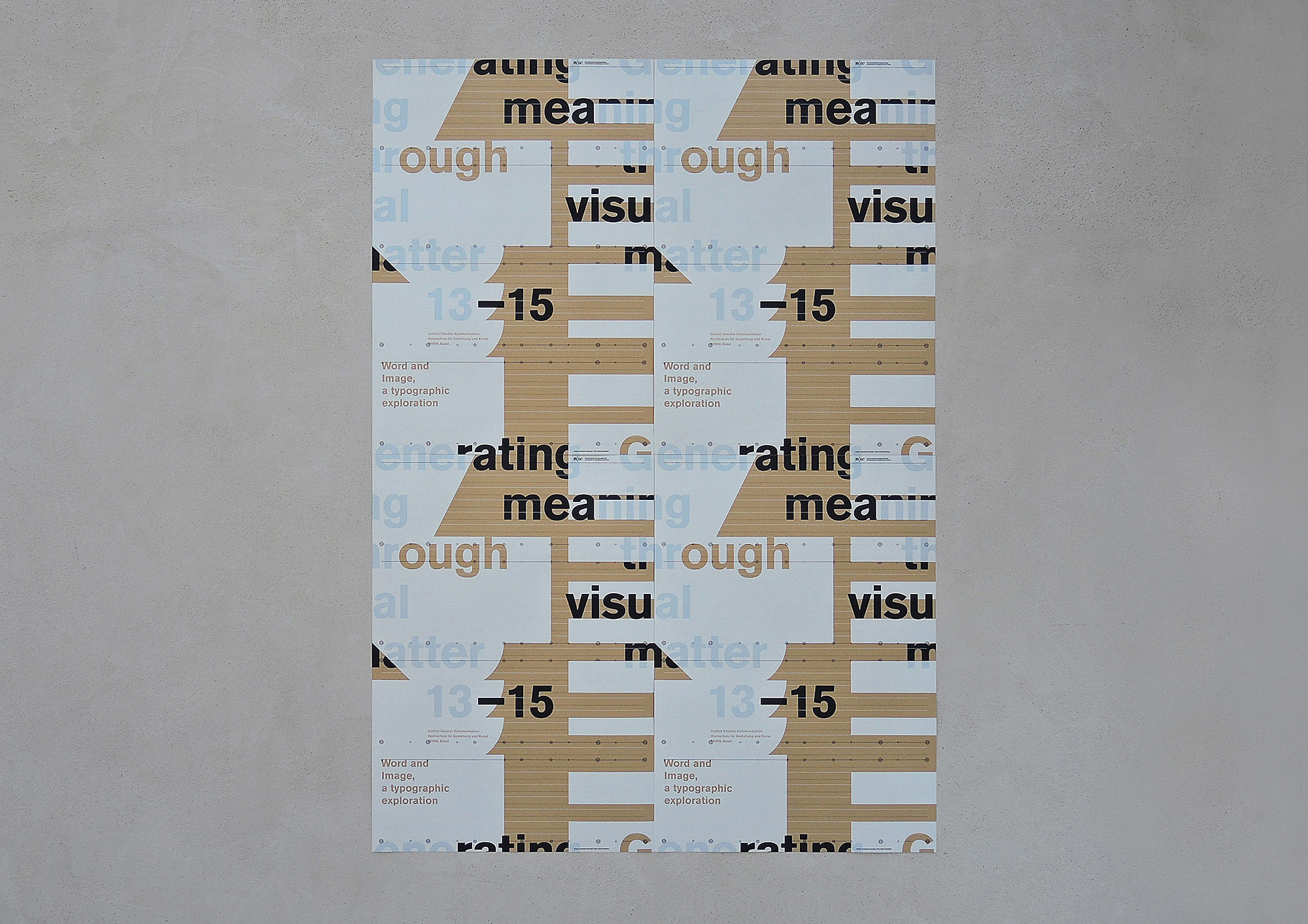
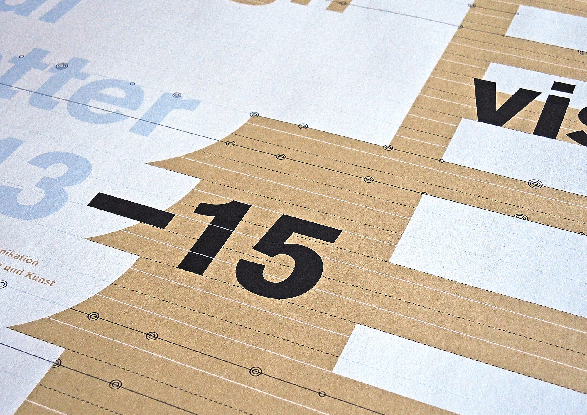
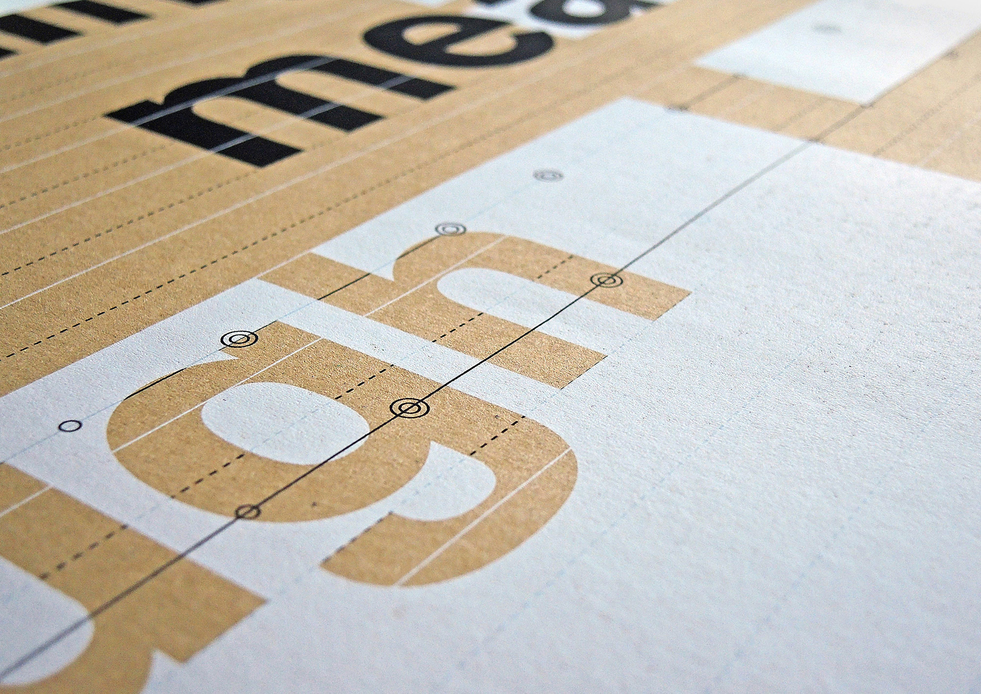
Generating Meaning Through Visual Matter.
Word and Image – a Typographic Exploration.


This project is about a theme, which plays a very important role in graphic design and visual communication. Moreover, in a broader overview, word and image topics include a wide range of different disciplines, from linguistics and the theatre to painting and sculpture. “The difference between word and image is simply the difference between hearing and seeing, speaking and depicting.”
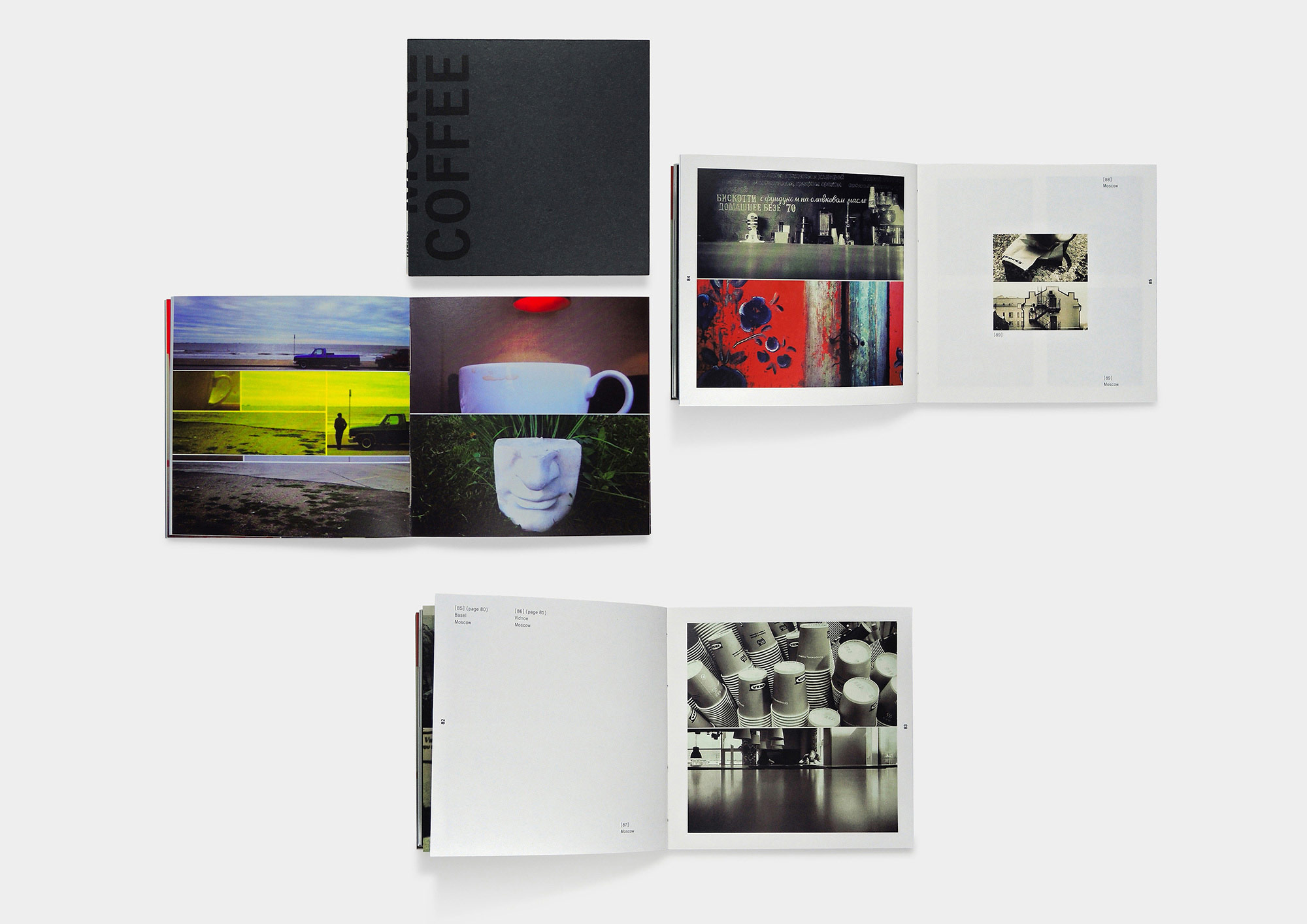
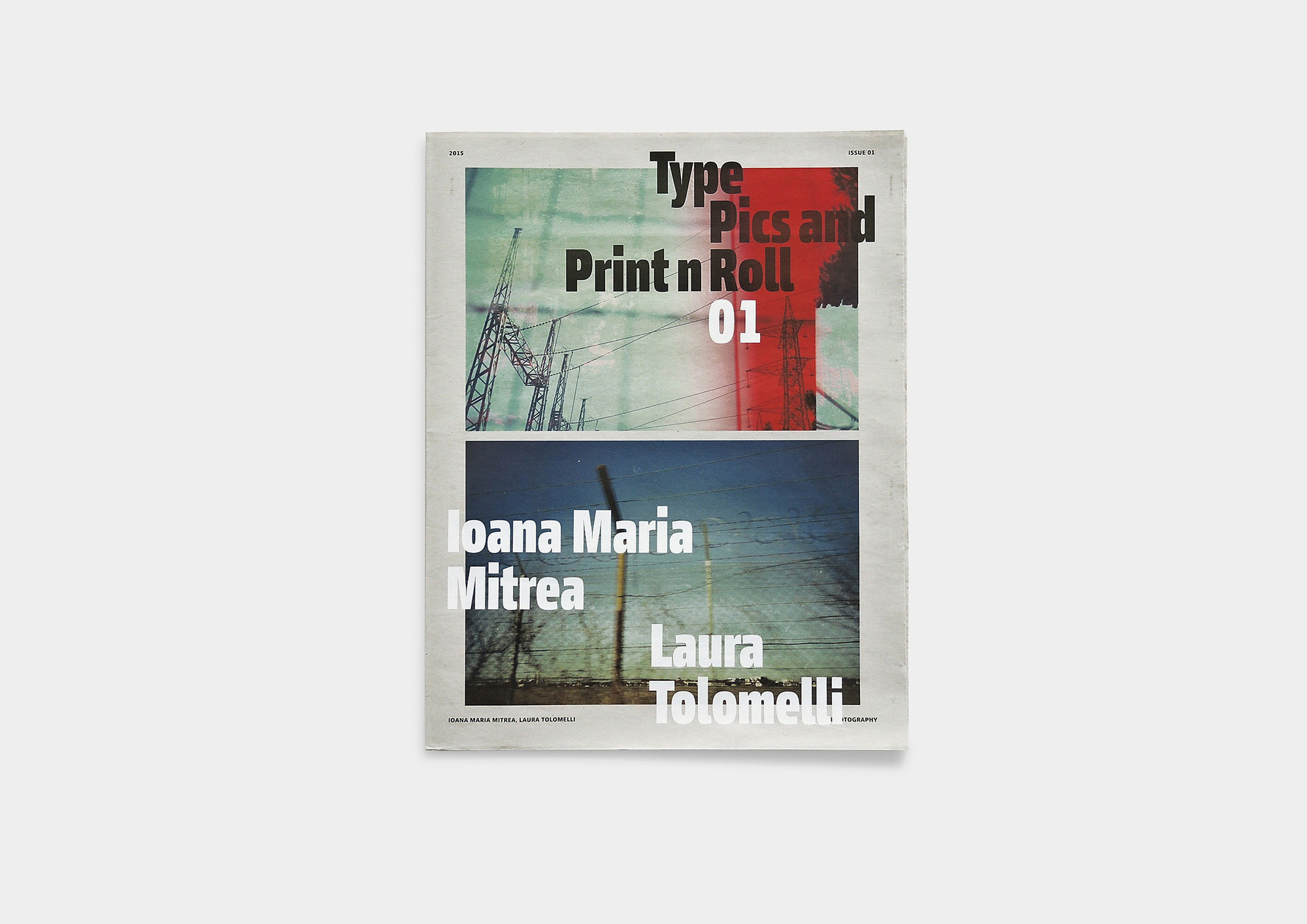
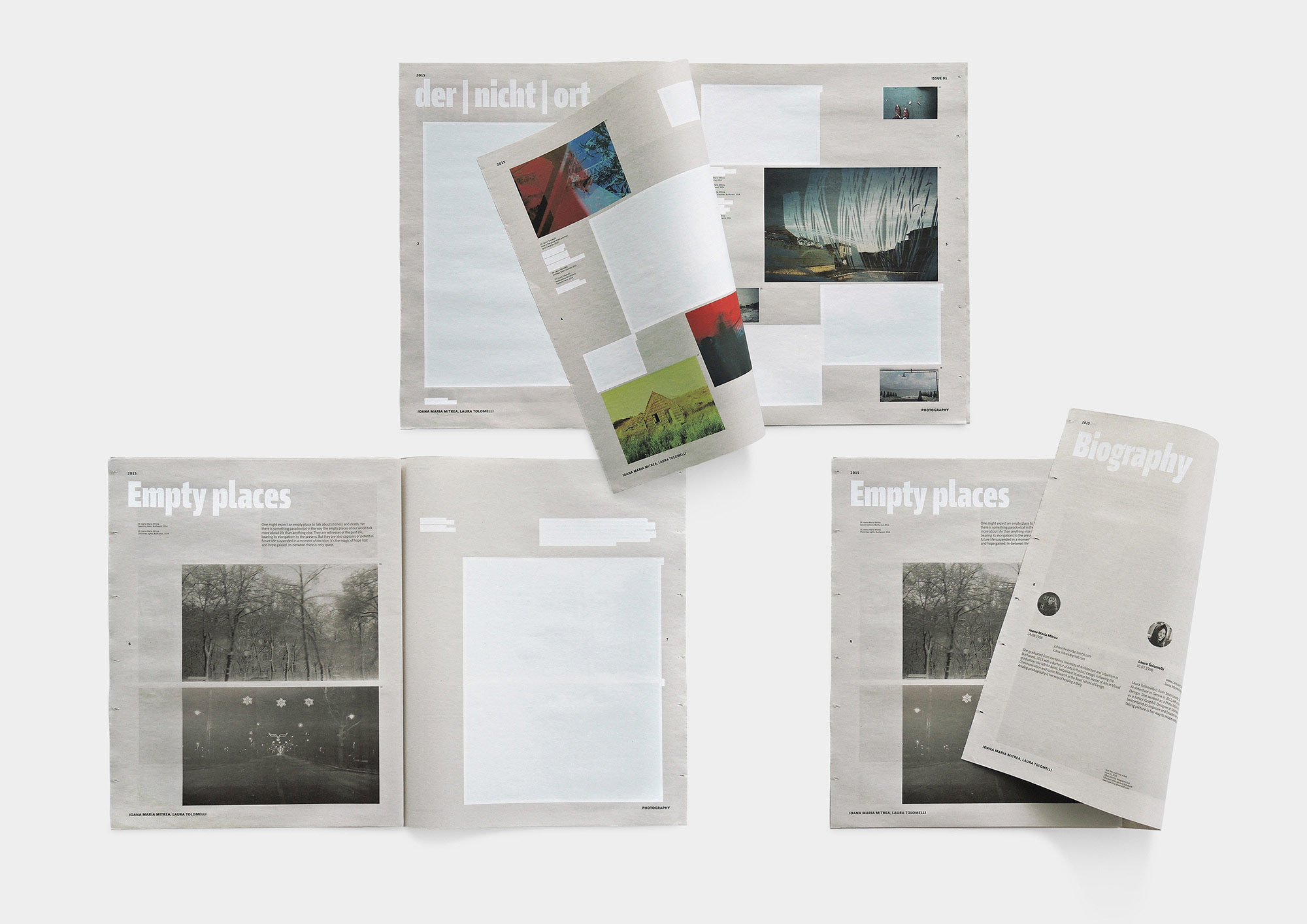
The present research mostly refers to printed media, in particular to multipage publications such as books, catalogues, brochures, etc.
One of the main purposes of this project was a fusion of personal practical experience and theoretical knowledge that was developed before and has already been evaluated and recognized. The present study is an attempt to look at the problem of words versus images from the point of view of analysis; in other words: to try and figure out what we are dealing with, what kind of material we have and how these different elements are linked and work together; and what points of view and how many procedures we have to find convincing solutions. It was also highly important to figure out a certain hierarchy based on the different phenomena, definitions, and terms depending on the matter of research. Knowing this, it is possible to establish a broad number of design variations and creative ways regarding different topics and tasks.
Without doubt, and this is highly important, typography in this project assumes the main role. This is a crucial point of the whole study. Typography plays the role of combining and merging verbal and visual languages because it includes some characteristics of both. It acts as a core element in a layout-creating process and space-organizing system as well. Based on this, questions of the general rhythm of a book, the composition of double pages, visual and metric combinations of text and image, all have quite a strong reference to typography. Besides, the time and space categories which the designer operates with in his work are, more or less, related to typographic issues, because Lessing’s classic argument as to images seen in space and words read in time, is not complete. Words can also be seen in space and images in time.
However, we have to note here that typography as a central point, applied to this research, is not necessary as a starting point of the design process. A designer has a very wide range of possibilities, from choosing an initial point of inspiration to using different printing techniques and materials which refer to visual values and haptic perceptions, for instance.
Coming back to the main theme of the project, it is quite interesting to note, that the research process itself did not simply consist in finding an answer to an already established schema. In contrast to this, an investigation based on a design in combination with different theoretical views, sometimes has exciting results which may change our mind when perceiving obvious things. This process was not a task with a known answer in the end. Moreover, it is probably not feasible, to provide a strictly defined conclusion suitable for everybody as a rule or guideline. In short:, we can talk about a certain structure of different visual relationships in a context of word and image which has a theoretical justification and could be used in practice. Even retreating from this formal approach could very well help to distinguish interesting and convincing aspects, providing an acceptance of the approach as such.
Konstantin Eremenko
cf.eremenko@gmail.com, www.eremenko-vis.com
Institut Visuelle Kommunikation, FHNW HGK, Freilager-Platz 1, CH-4023 Basel
+41 61 228 41 11, info.vis_com.hgk@fhnw.ch, www.fhnw.ch/hgk/ivk